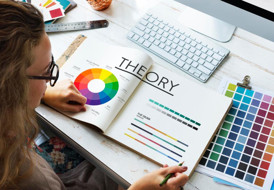
Color it’s a powerful tool that can influence user behavior, shape brand perception, and even impact conversion rates. For startups, understanding the psychology of color is essential for creating a website that not only looks appealing but also communicates the right message to potential customers. Colors evoke emotions and associations that can vary by culture, personal experience, and even industry norms. By strategically selecting colors, you can enhance user experience, foster trust, and encourage engagement on your website.
1. Red: Excitement and Urgency

Red is one of the most stimulating colors, associated with energy, passion, and urgency. It is often used to grab attention and encourage action, making it ideal for buttons, calls-to-action, or important notifications. However, red can also evoke strong emotions, so it’s best used sparingly and strategically. For e-commerce startups, red can drive conversions when used in “Buy Now” or “Limited Offer” buttons, creating a sense of urgency that encourages users to act.
2. Blue: Trust and Professionalism

Blue is widely recognized as a color that conveys trust, professionalism, and calmness, which is why many corporate and tech companies, including banks and social media platforms, incorporate it into their branding. Blue has a calming effect, which can help users feel at ease and trust the information on a site. Startups looking to build a reliable image or connect with a professional audience can benefit from incorporating shades of blue into their web design, especially in headers, backgrounds, or logos.
3. Green: Growth and Balance

Green is closely associated with nature, growth, and balance. It often evokes feelings of health, freshness, and sustainability. For startups in the health, wellness, or eco-friendly industries, green can be an excellent choice for backgrounds, accent colors, and interactive elements. It signals that the company values sustainability and wellness, creating a positive association with environmentally conscious audiences. Green also tends to be easy on the eyes, making it a popular choice for call-to-action buttons.
4. Yellow: Optimism and Creativity

Yellow is a color of optimism, warmth, and creativity, evoking feelings of happiness and energy. It can be highly effective in engaging visitors, especially when used to highlight unique features or promotions. However, yellow can sometimes be overwhelming if used excessively, so it’s best to apply it as an accent color in buttons, icons, or key content areas. For startups in the creative, entertainment, or travel industries, yellow can help create a welcoming and lively atmosphere on a website.
5. Black and White: Simplicity and Elegance

While black and white are often used as neutral colors, they play a significant role in creating contrast, balance, and sophistication on a website. Black is frequently associated with luxury, power, and elegance, making it a popular choice for fashion and high-end brands. White, on the other hand, conveys simplicity and purity, often used to create clean, modern layouts that highlight content effectively. Together, black and white can form a powerful minimalist aesthetic, ideal for startups looking to communicate sophistication and clarity.
6. Orange: Confidence and Friendliness

Orange combines the energy of red with the warmth of yellow, symbolizing confidence, friendliness, and enthusiasm. It’s an approachable color often used to evoke excitement and creativity, making it well-suited for innovative, energetic brands. Orange is frequently applied in call-to-action buttons or as an accent color to create a welcoming atmosphere. For startups aiming to establish a friendly and energetic brand image, orange can enhance user engagement and create an inviting website.
7. Purple: Creativity and Luxury

Purple is associated with luxury, creativity, and wisdom, historically seen as a color of royalty and sophistication. It has a mysterious quality, often appealing to audiences in industries such as beauty, wellness, and technology. Purple can add a sense of innovation and imagination to a website, making it an excellent choice for startups looking to position themselves as unique and visionary. By using purple in banners, icons, or accent elements, brands can create a memorable impression on users.
Choosing the Right Color Scheme for Your Brand
Choosing a color scheme goes beyond selecting a few favorite shades. Start by defining the emotions and associations you want users to feel when visiting your site. Consider your industry, target audience, and brand values. Once you have a foundation, build a color palette that includes primary colors for brand identity, secondary colors for accents, and neutral tones for balance. Ensure consistency by applying your chosen colors across all design elements, from buttons and backgrounds to typography and images.
The psychology of color in web design is a subtle yet powerful way to enhance user experience and create a meaningful connection with your audience. By understanding how different colors influence emotions and behavior, startups can build websites that resonate with users, communicate their brand’s essence, and ultimately drive engagement and conversions.


